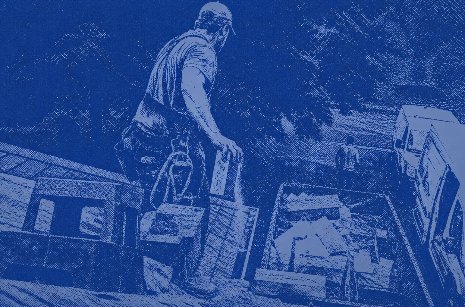
Growth Systems Built for Contractors
Websites, Local SEO, and Google Local Services Ads designed to help service businesses generate more calls, booked jobs, and long‑term growth.
Get Your Free Strategy Call
Fill out the form and a specialist will reach out shortly.
Everything You Need to Win Online
We offer the three most powerful digital marketing services for home service businesses — done right, done by real people, done in the USA.

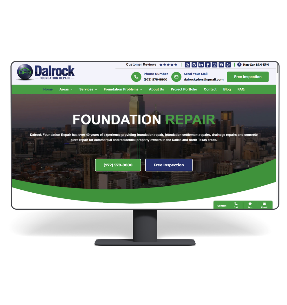
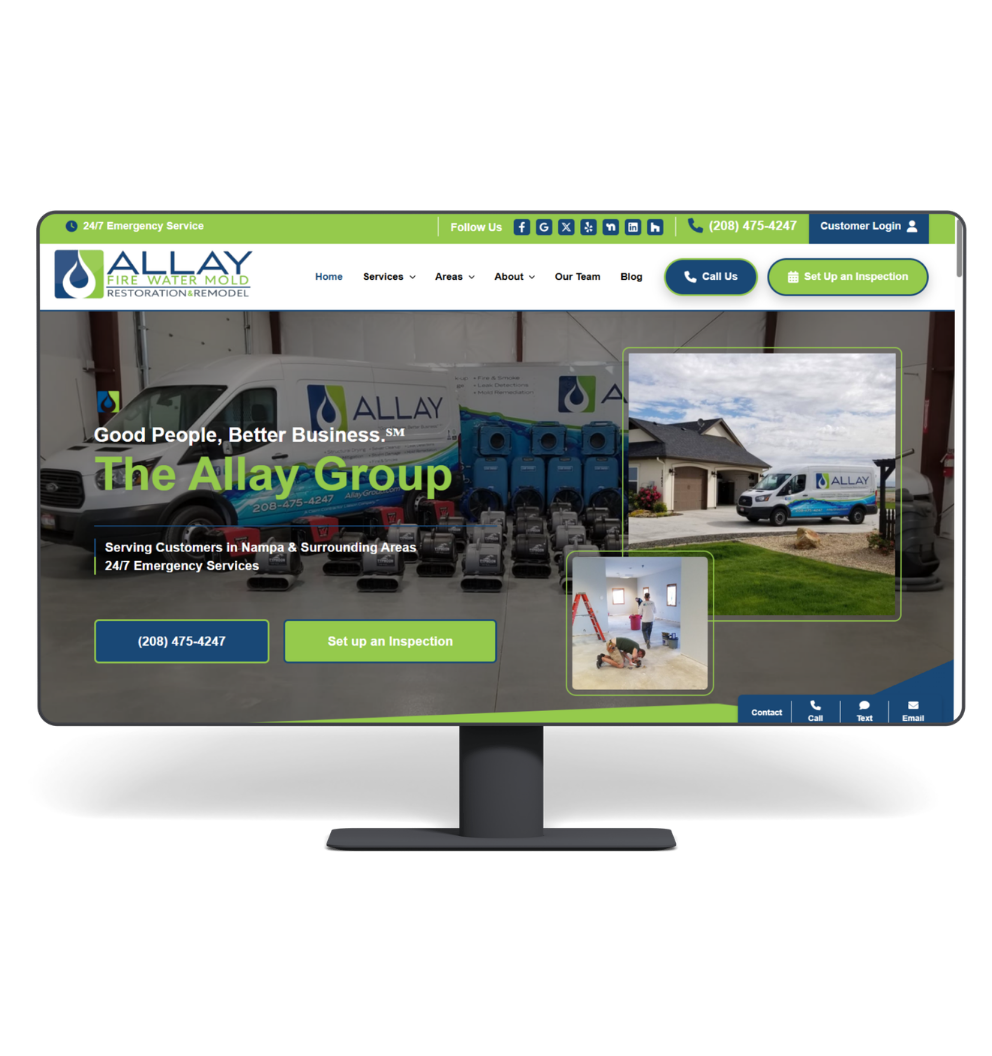
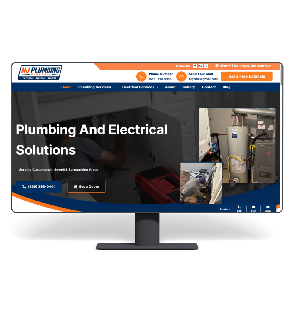
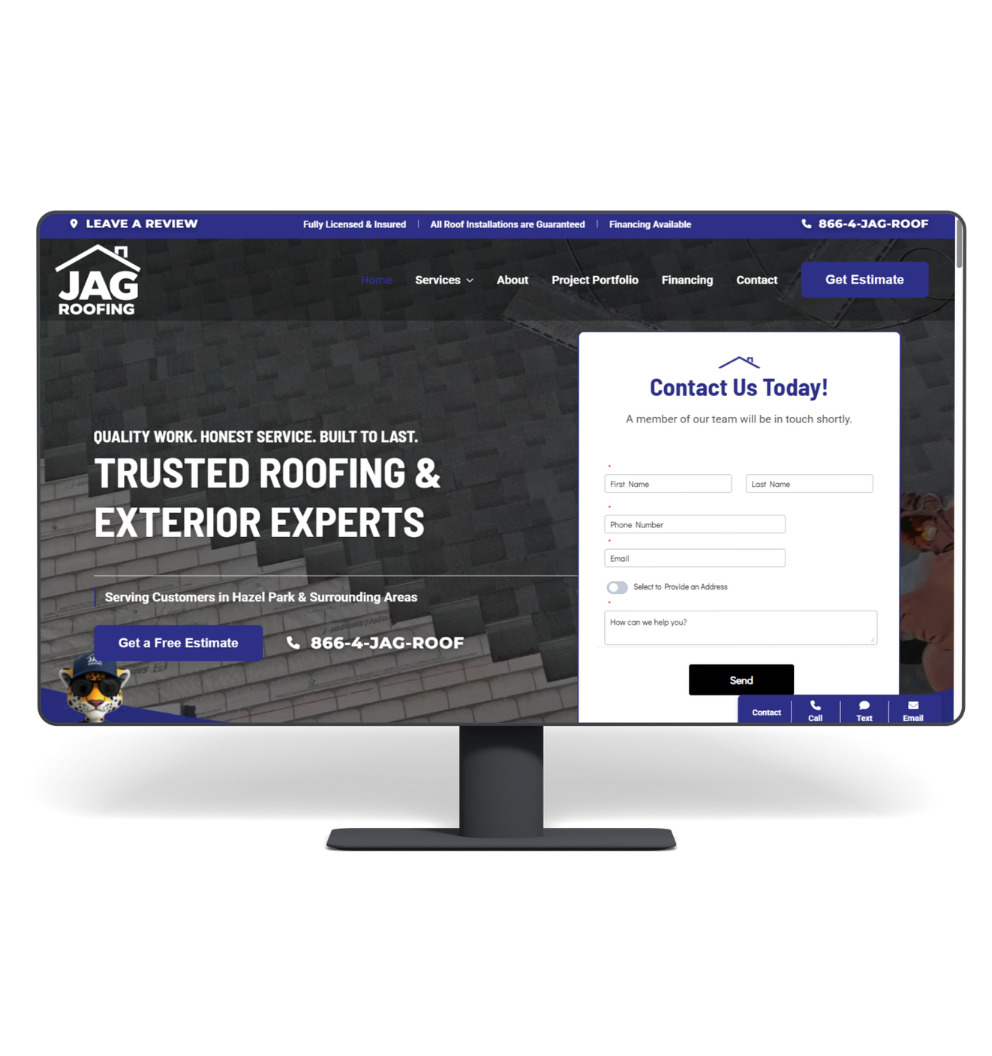
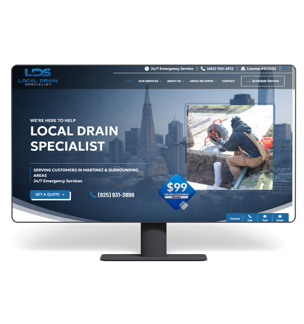
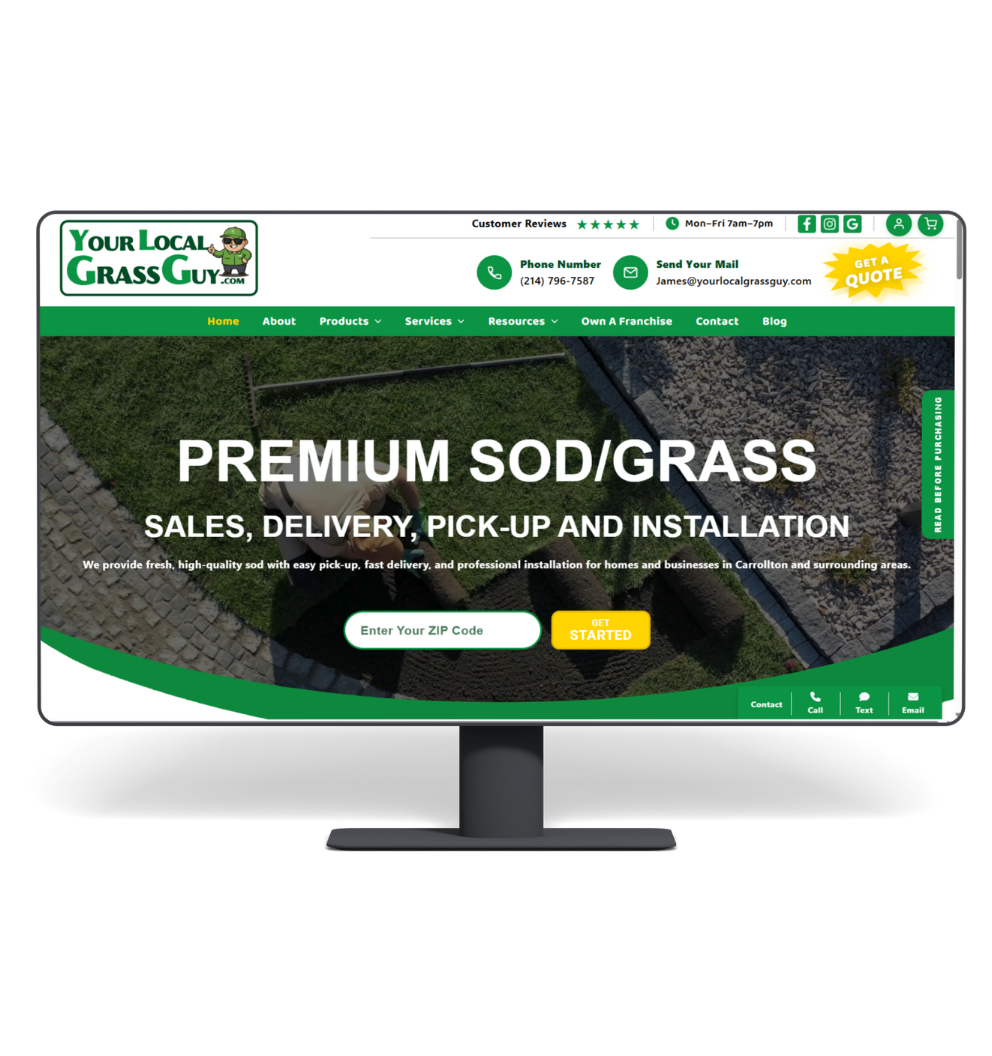
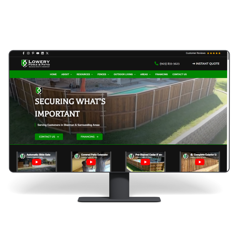
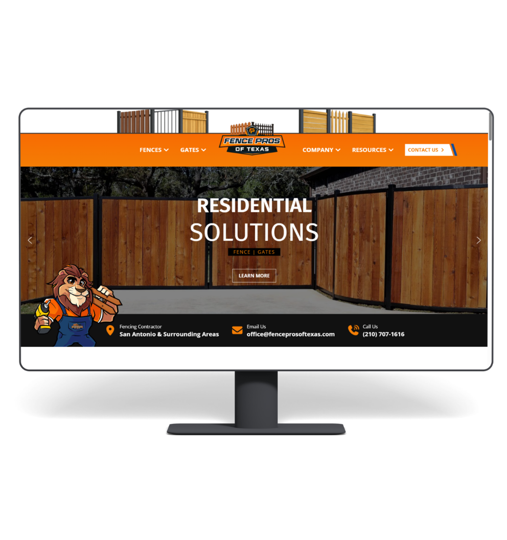
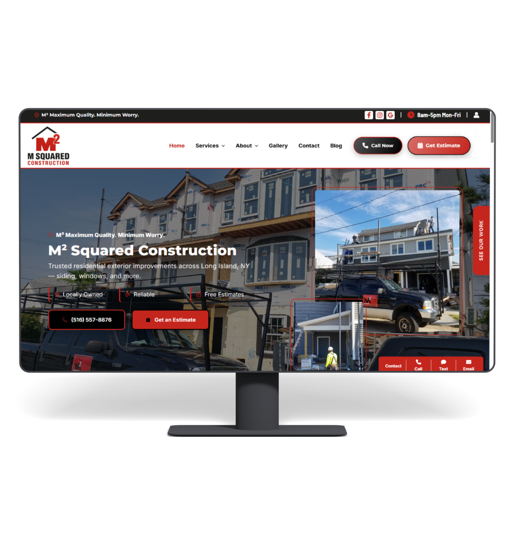
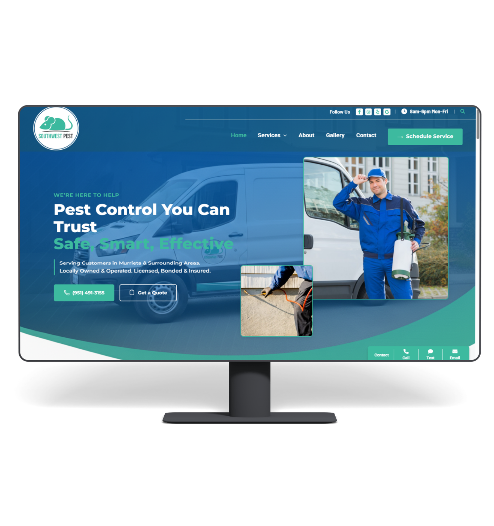
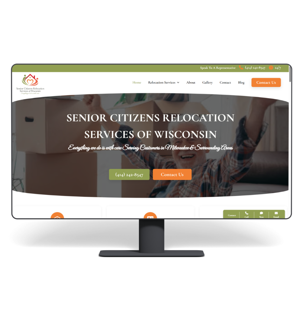
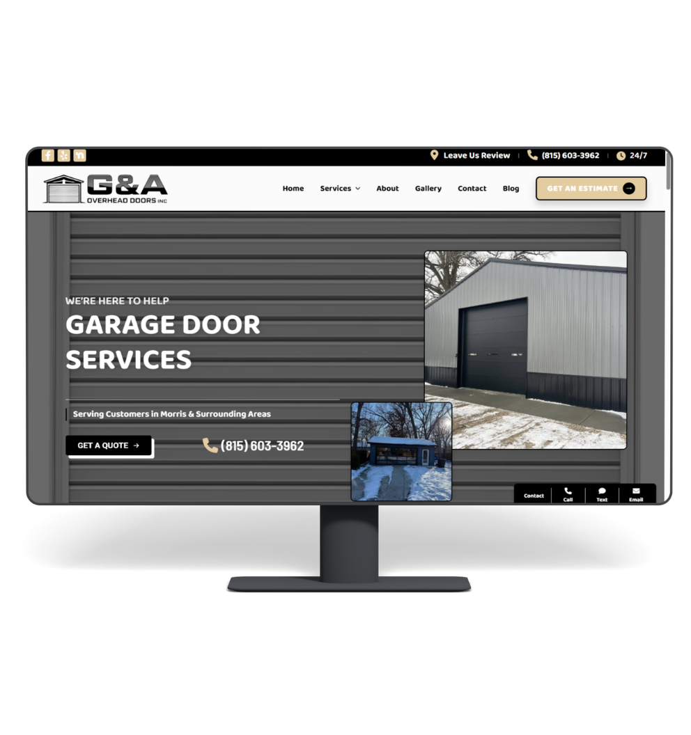
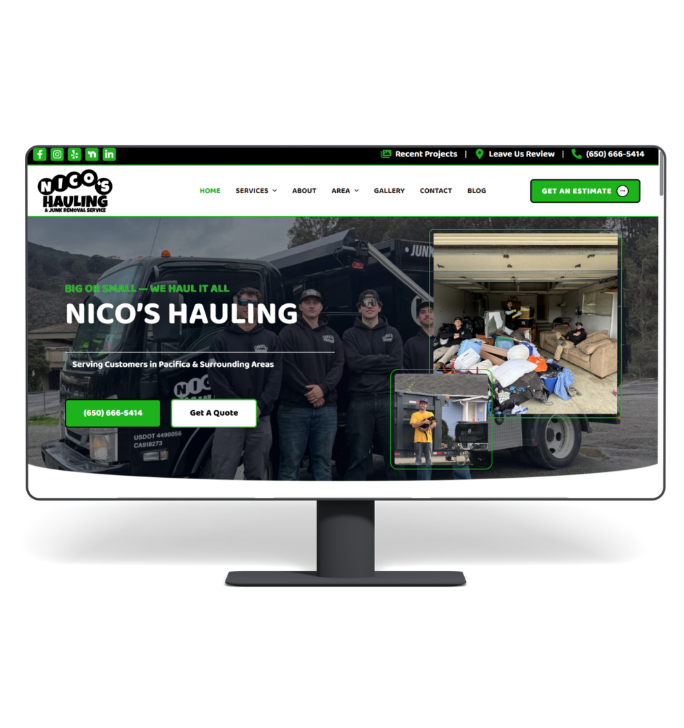
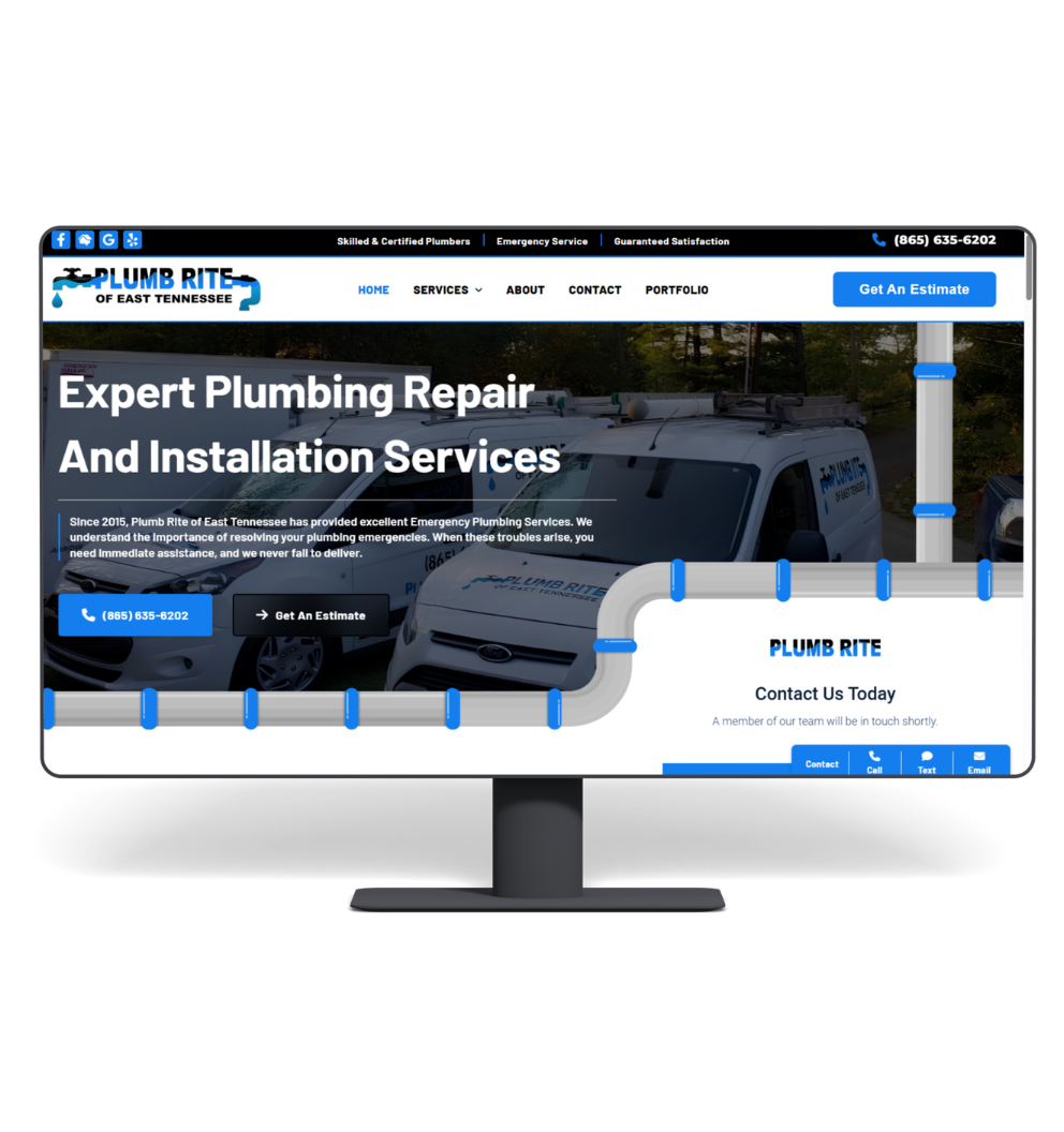
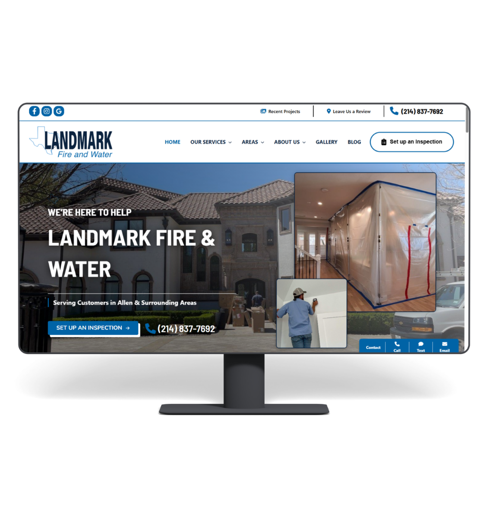
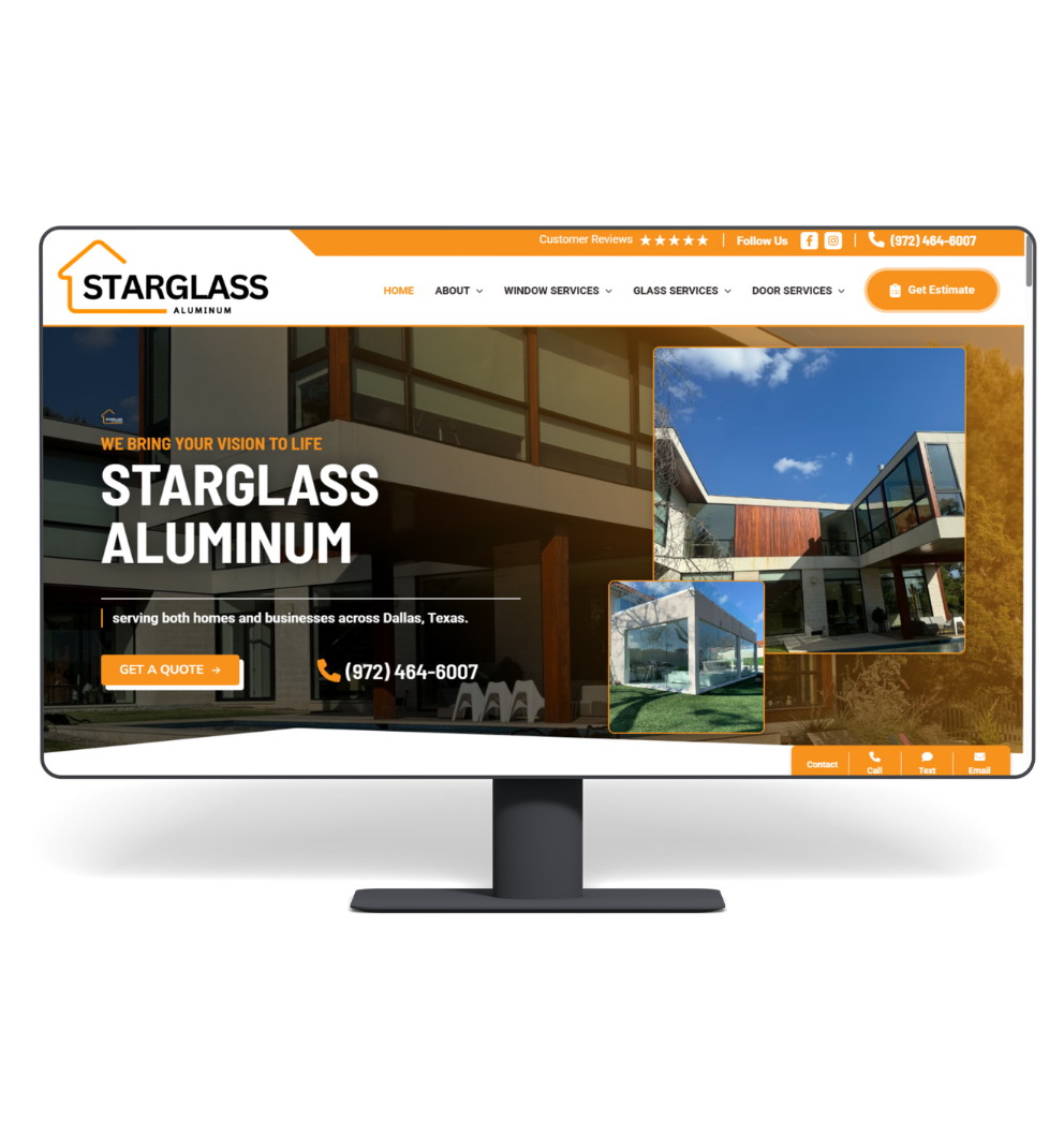
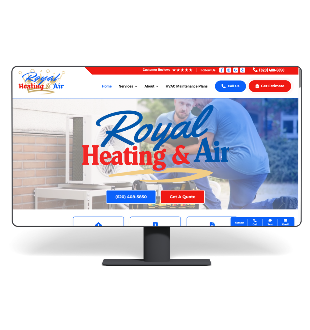
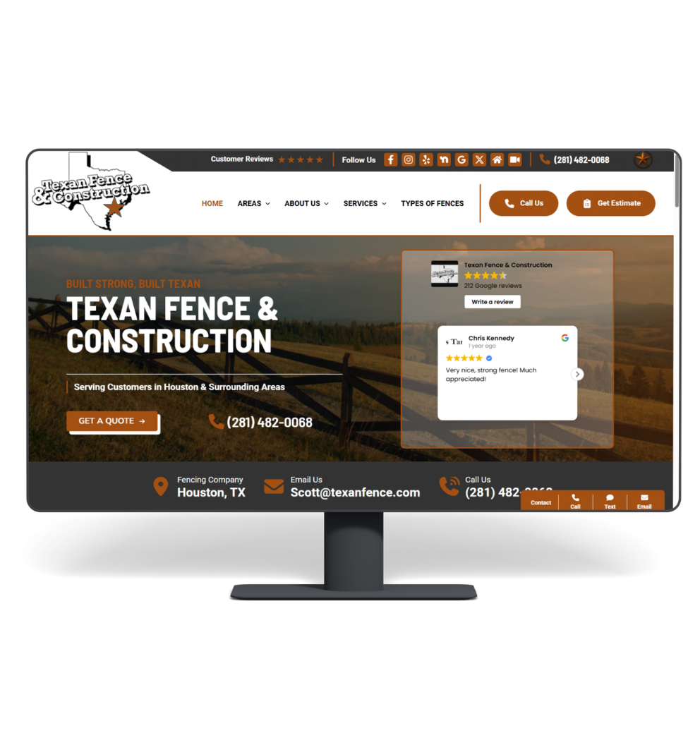
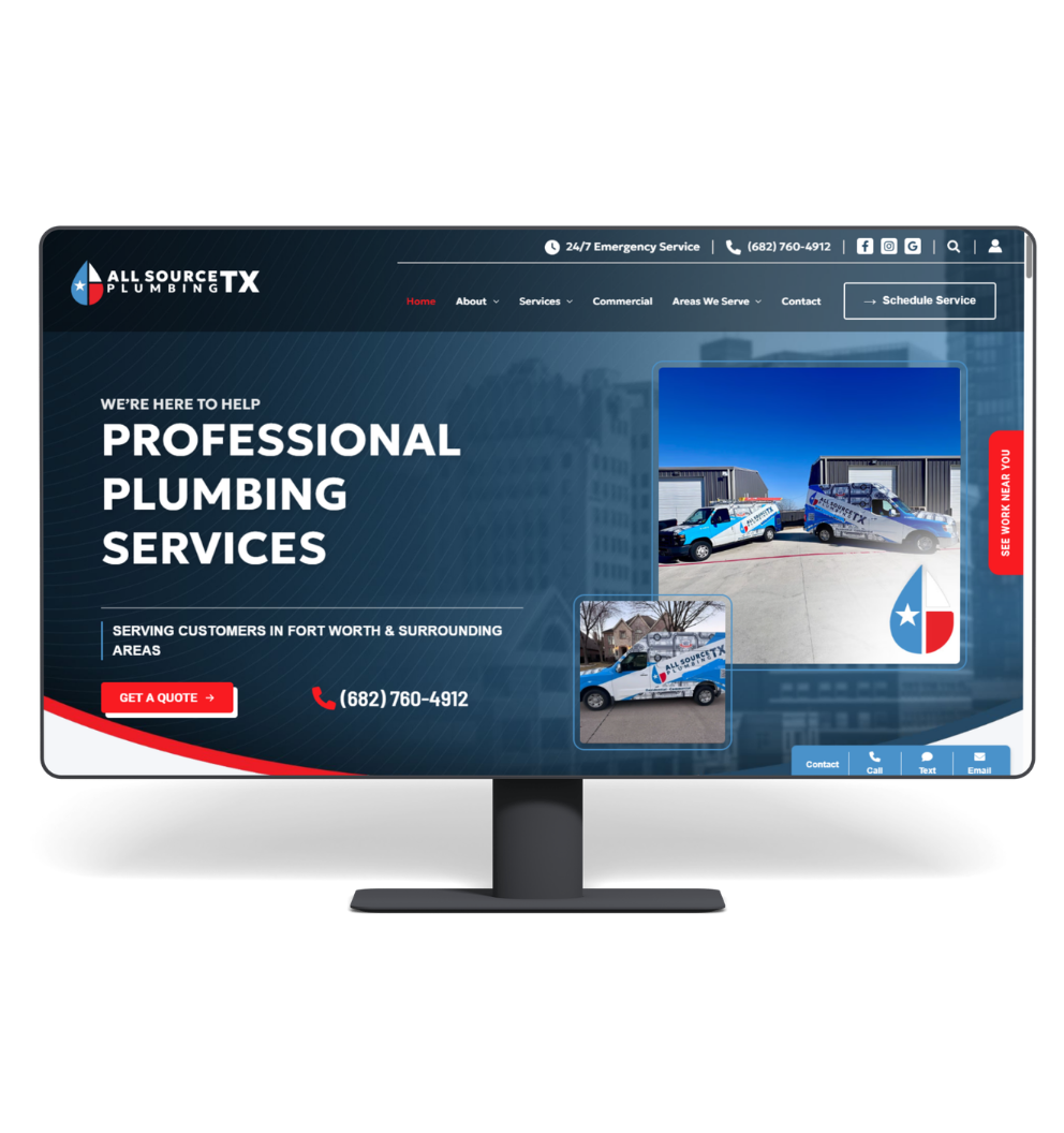
Professional Websites
High-converting websites built for service businesses. Mobile‑first, fast‑loading, and designed to turn visitors into paying customers.
Local SEO
Dominate Google search and Maps in your service area. Get in front of customers who are actively looking to hire — right now.
Local Service Ads
Top of Google with the “Google Verified” badge — LSA drives high-intent calls at a low cost per lead, not per click.
We Only Work With
Service Businesses
We don’t do restaurants, ecommerce, or SaaS. Every strategy, every tactic, every campaign is built around winning for trades and home service companies.


Preston and his team have been nothing but professional, helpful and prompt in building my website. They built a professional and well balanced representation for my new customers to learn about my company. I highly recommend Click Wise for your service business website needs.
We at Parker Tree Service have had an amazing experience working with Click Wise Design. They rebuilt our website, handled our SEO, and set up/managed our LSA — everything has been done professionally and the results have been excellent. Huge thanks to Gavin, Jaron, and Edan.
After working with Click Wise Design, the difference has been night and day. They completely revitalized our website, making it clean, modern, and professional. The contact page is finally generating real inquiries. Their team was professional, responsive, and easy to work with throughout.
I am the owner of TrailAir HVAC in Salt Lake City, Utah. I found Click Wise Design a few months ago. They have helped me with my website and much more. They are quick to respond to any questions or needs I have. I highly recommend them for any website needs.
I worked with Clickwise Design for about a year and had a great experience. They are always helpful, responsive, and supportive whenever I need updates or assistance with my site. Everything is handled professionally and I appreciated the effort they put into keeping things running smoothly.
Built for the Trades & Home Services
We’ve helped businesses across every major home service category dominate their local market online.
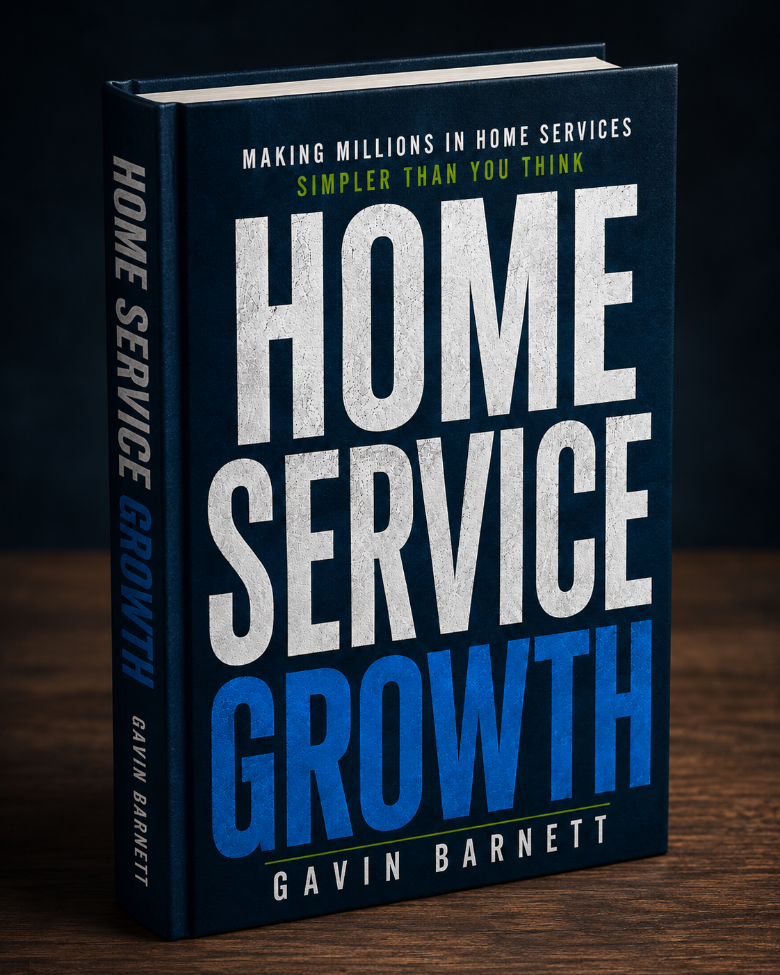
Get the Free Book:
Home Service Growth
Gavin Barnett shares the proven marketing strategies he’s learned from working with more than 2,000 service businesses. Websites, SEO, LSAs, reviews, social media — all in one free guide.
Get Your Free Copy


Frequently Asked Questions
How do I know your marketing will actually generate leads?
Everything we do is focused on generating real business growth — not vanity metrics. From SEO to Google Ads to website optimization, our strategies are designed to increase calls, form submissions, and booked jobs.
What makes Click Wise Design different from other agencies?
We work specifically with home service businesses. That means we understand your industry, your customers, and what actually drives results in local service markets.
Am I locked into a long-term contract?
We typically work month-to-month because we believe agencies should earn their clients through performance — not long-term commitments.
Will I actually be able to reach someone when I need help?
Yes. You'll work with a responsive, US-based team that communicates clearly and stays actively involved in your account.
How can I track the results of my campaigns?
You'll have access to clear reporting and real performance data so you can see exactly how your marketing investment is performing.
Do you use outsourced freelancers or overseas support?
No. Your account is managed directly by our in-house team to ensure quality, communication, and accountability.
Can you help if I already have a website?
Absolutely. We can improve your existing website, rebuild it if needed, or create a strategy around increasing conversions and lead generation.
What types of businesses do you work with?
We primarily work with home service and trade businesses, including HVAC, plumbing, roofing, landscaping, tree service, pool companies, electricians, and more.
How long does it take to see results?
Some improvements can happen quickly, especially with website optimization and paid ads. SEO and long-term growth strategies typically build momentum over several months.
What if I've had a bad experience with another agency?
A lot of our clients come to us after feeling frustrated with poor communication, lack of transparency, or weak results elsewhere. Our focus is on honest communication, measurable performance, and long-term partnerships.

More Visibility. More Calls.
More Revenue.
Everything your business needs to rank higher, attract better customers, and grow consistently online.
Get Your Free Strategy Call
Fill out the form and a specialist will reach out shortly.